See more
Tampax items: American ad from August 1965 - nudity in
an ad: May 1992 (United
Kingdom) - a sign
advertising Tampax during World War II - the
original patent
- an instruction
sheet from the 1930s
See a Modess True or
False? ad in The American Girl magazine,
January 1947, and actress Carol
Lynley in "How Shall I Tell My Daughter"
booklet ad (1955) - Modess
. . . . because ads (many dates).


|

Was Tampax the
first French commercial tampon?
Tampax menstrual tampons, 1938, France
and U.S.A.
Typography of
the boxes
Even though Tampax produced both
10-count boxes in the U.S., according
to the information on the sides, the
type comes out slightly different on
each.
The boxes appear to be printed by
letterpress, essentially the way
Gutenberg printed his first books
about 1450. In the enlarged letters,
below, you can see the irregular
surface of the individual metal
letters that the press - press, get
it? - pressed into the cardboard. And
the same letters look slightly
different because of the difficulty of
making all type alike, and the
individual letters wear out. Early
printers had the same problems, as
told in "L'Apparition du Livre "(The
Coming of the Book), by Lucien Febvre
and Henri-Jean Martin.
Compare that with a 1970 Tampax box
printed by photolithography, below,
the usual way today, which leaves a
smooth surface. Instead of the metal
type pressing into the cardboard a
photographic film allows ink to lie
only on certain parts of the
cardboard. Today someone (I did this
for years) at a computer designs text
and illustrations for books, boxes,
calendars and magazines and then sends
the work as an electronic file to a
printing press; people there convert
it to a photographic plate and print
it. Letterpress is seldom used on
large or complicated jobs.
Tambrands generously donated
these boxes, part of a large gift of
menstrual products from its
archives.
Harry Finley created the images.
|
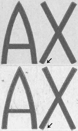 |
The arrows point to the X's on the
large word Tampax on each box,
American above and French below. The
American X sits lower. There are small
differences between the letters on the
two boxes.
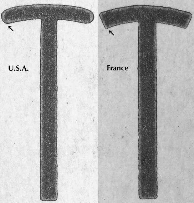
Below:
look how the T's differ, showing the
most obvious difference between the
typefaces. The differences in light
and dark within the letters (enlarged
1200%) show how the metal type,
probably old and worn (like me),
pressed against the cardboard. Modern
photolithography makes a smoother
image (under this image).
|
 |
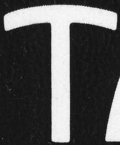 |
A Tampax T from a 1970 box (1200%).
The fuzzy stuff in the dark part is
from the cardboard. The image is
cleaner than the image from metal
type.
|
NEXT: Tampons - boxes, typography, tampons, interior of
directions, exterior
of directions
See more
Tampax items: See instructions
for the 1936 Tampax - and the box,
etc. See Dutch
Tampax ads from 1938 (and here,
virtually identical to a contemporary
American ad)American ad from August 1965 -
nudity in an ad: May 1992 (United
Kingdom) - a sign
advertising Tampax during World War II
- the original patent -
an instruction
sheet from the 1930s
copyright 2006 Harry Finley
|
|